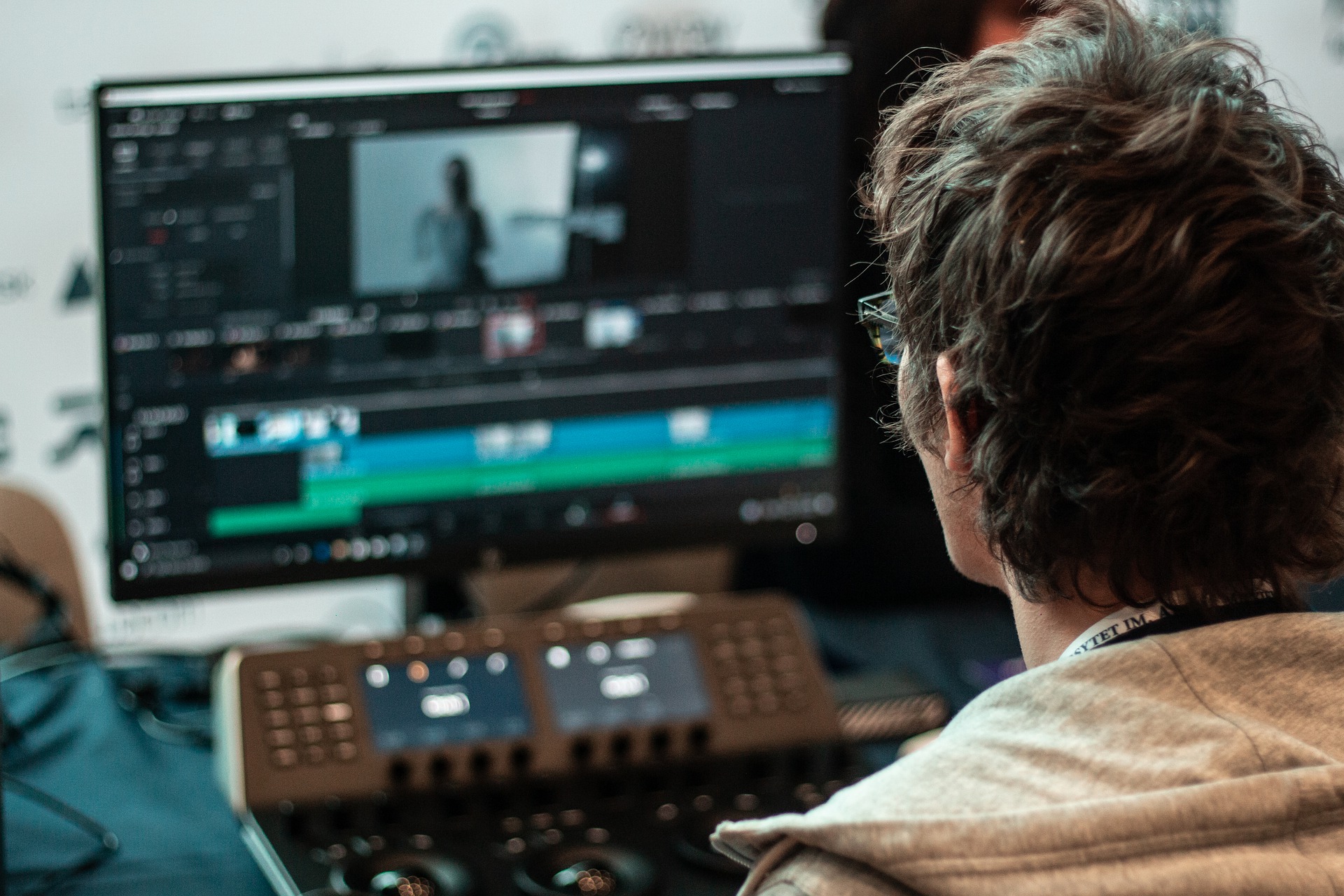
Nearly 80% of customers believe that colors improve brand recognition. Most of the time, finding the perfect color is a challenge. In that case, color correction is a must. This service included adjusting saturation, hue, shadow, enhancement, brightness, and many more related to the color. All these adjustments are essential for the white appearing white and black to present perfectly black. Correcting color is the best move to commence an image of how the human eye sees it. The problem occurs when the artist makes mistakes or has less sense of color.
Here some common mistakes are focused, that you must avoid as a beginner.
- Using peculiar colors: If you are not using the colors properly, it may appear unnatural. That is where color concept actions result in reality. For instance, on a rainy day, the sky seems dull and dark. It will be questionable if you make the sky color orange in a rainy-day image.
- Strange skin tones: Viewers do not notice the skin tone generally, but they mark if the skin seems odd. This will disrupt spectators from the picture. Even though the artistic appearance is intense, always keep a keen eye out for skin tones. For instance, a dancer is performing on a stage in your image. The skin tone may look red for the red spotlight, but it will become strange if she were to dance on the open stage in daylight.
- Overusing the beauty features: For white teeth, consistent hair color, or make shiny eyes, sometimes you would use more beautification for good looking. This may result in wrong usage due to overuse. Excessive enhancements in skin, teeth, or eyes seem like aliens. So, you have to be careful while using color correction makeup.
- Wrong color combination: A picture is destroyed if the color combination is not even. You will find a distracting vibe from the image when the colors in an object come in the wrong order. To ignore this, you must understand that some colors are created for each other while some are not good together. So, you should pick up a color wheel to see some palettes of color.
- Imbalanced saturation: Saturation is important for a picture. It may seem over-colored if you increase the saturation. On the other hand, the image may seem boring if you decrease the saturation. In brief, an imbalance of saturation in an image is nothing but eye-pain for the viewers. To use it effectively, you have to adjust the saturation perfectly.
- Hair Fixation: Sometimes, you may need the same model in different hair color. So, during hair color correction, most of the time the hair loses it’s natural look. It is a great concern for the artist to ignore these hair color mistakes.
Final Thought
Any of these mistakes you may have made at any time in your image editing life cycle. Yet, doing perfect correction needs a long time of practice and strong color sense. If you have bulk images and a tight schedule, you can take service from a service provider. In Creative Clipping Path, you will find reasonable color correction costs for high-end images. So, avoid these common mistakes, get help for the best outcomes for images.

